1) Is the correlation between Radiation Exposure Index and the Cancer Mortality Rate positive or negative? That is, are higher levels of one generally associated with higher rates of the other (positive) or lower rates (negative)? Describe how this aspect of the relationship between the two variables is apparent in the maps, in the data table, and in the scatterplot.
2) How strong is the correlation? Is there a distinct pattern (strong) or does the relationship appear random (weak) or somewhere in between?
3) Use the scatterplot of the relationship and determine the equation of the line of best fit. Describe what the slope of the line tells you about the relationship between the Radiation Exposure Index and the Cancer Mortality Rate.
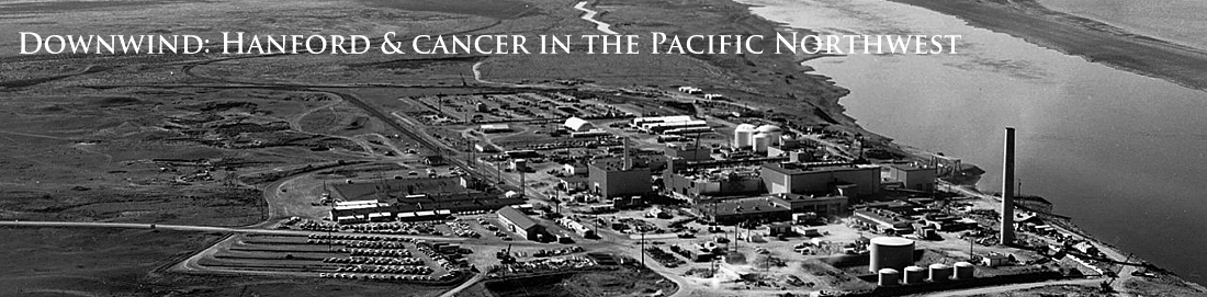
4) Write a summary of the relationship you see in the data between river-borne exposure to radiation from Hanford and cancer mortality in the Oregon counties down river from the plant..
5) Read Fadeley's own summary of his research. Discuss similarities and differences with your own observations.
6) Recent cancer mortality data is available in the map, graph and table. Analyze and describe the relationship between the Radiation Exposure Index and Cancer Mortality Rate in 2011.
7) Critics of Fadeley's conclusions focused on the time it takes for cancer and death to result from radiation exposure. Do some research on this topic and comment.