|
|
|
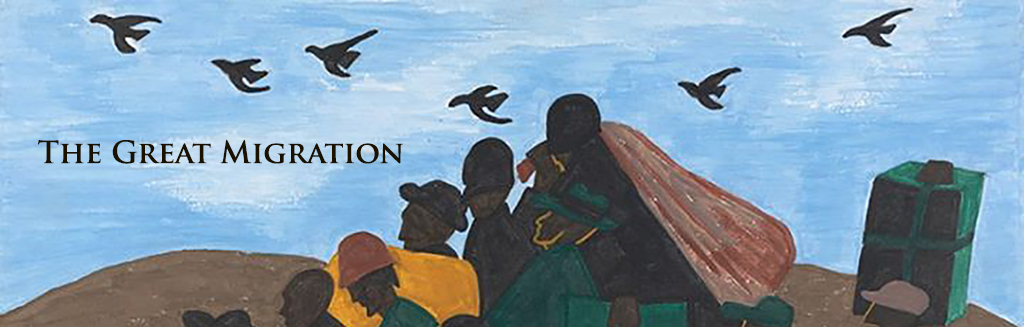
Examining Conclusions
In the years since the Great Migration historians have drawn a variety of conclusions about this mass exodus from the South - conclusions that can be tested in many cases by examining related census data. Consider the following propositions:
| • |
A greater percentage of males than females migrated. |
| • |
The exodus included a disproportionately larger segment of the literate/skilled black population. |
| • |
The migration north tended to come more from southern urban centers rather than from rural areas. |
You are going to examine these conclusions focusing on several southern cities and the surrounding counties as suggested in the following example and questions. |
In her book, Farewell, We're Good and Gone, Carole Marks presents a detailed history of the Great Migration. In her conclusion she writes:
- ... certain types of migrants leave in fairly predictable patterns. Young literate men, possessing some formal education and previous manufacturing experience are among those most likely to move. They are not alone. For those who are married, women play a direct and necessary role, sustaining their families while their husbands search for work and continuing to supplement meager salaries once they are resettled. 1
Among other things, Marks is suggesting that more males migrated than females; that young men, single as well as married, were among the first to migrate - hoping to settle into a job and place to live before they brought their families North; that it was predominately literate African Americans who made the trip north. Let's see if the data you have available from across three decades supports these conclusions |

Ratio of Negro Females to Negro Males
in Counties Around Atlanta Georgia - 1900
Click map to enlarge
|
|
If Marks is right we should be able to see a difference in the relative percentage of African American men and women in the southern population from 1900 to 1930. Let's start by looking specifically at the counties surrounding Atlanta, Georgia. Open the Great Migration map and turn on the Georgia layer for 1900. Use the available Bookmark to zoom in on the state. Turn all other layers off. Filter the data so that only the counties surrounding Atlanta (City is Atlanta) are selected. Select to Change Styles by Color and create a map similar to the one above. Show a Table of the data, click on the header of the (Negro Females to Negro Males) column, and sort the data from highest to lowest.
Prepare a similar map and table for the area around Atlanta in 1930. Make sure that you set the sliders to the same values on both maps so that comparison is straight forward.
-
1) What does it mean in terms of the migration if the ratio of females to males increased from 1900 to 1930? decreased?
-
a)
What general pattern do you see in the maps and tables for the Atlanta area? Are there exceptions?
b)
Is there is a shift towards a higher proportion of black females in the population of the counties surrounding Atlanta?
c) Compare and contrast the ratios of both black and white females to males for the counties around Atlanta with all Georgia counties.
2) What about in other parts of the south? Prepare similar maps and tables from the available data for the counties surrounding Montgomery, Alabama, Nashville Tennessee, or Franklin, Kentucky. Describe any differences or similarities in the area that you examined.
4) Check the work of your classmates. Does there seem to be a general pattern?
5) Based on the evidence you see, is Marks' conclusion about the number of males migrating versus the number of females correct? Explain.
-
6) Writing in 1918 in the midst of the Great Migration Carter Woodson characterized the movement north as the "migration of the “talented tenth." He noted that among the migrants were "Negro politicians," "educated Negroes," and most importantly that:
...the largest number of Negroes who have gone North during this period ... belong to the intelligent laboring class.2
In other words, Woodson is describing a migration that saw a disproportionately large percentage of the literate African American population move North. Seventy years later Carol Marks elaborated on this argument:
... migrants ... were rather representatives of a fledgling class of artisans and urban nonagricultural laborers as well as some farm owners and relatively prosperous tenants,...3
The census data available from 1900 and 1930 includes literacy data. Pick one of the four states for which there is data available both statewide and for a particular urban area and test the conclusions offered by Woodson and Marks. Write a short summary of your work incorporating appropriate maps and tables.
-
7) Gerald Early sees the migration in broader terms, as part of a more general shift in the American population as the country changed from a farm to an industrial economy:
... black migration must be understood as a more complex move than simply blacks going from the South to the North. The majority of black people still lived in the South in 1930s. The predominant pattern was for blacks to move from rural to urban, and so many, during these years, left the countryside for the southern cities. Some, like author Richard Wright, went on from places like Memphis, where he had migrated from Mississippi, to Chicago; others did not. This pattern of moving from rural to urban fit the general pattern of population shift for the United States as a whole, as whites, from the Progressive Era onward, were leaving the country and agriculture for more urban settings. 4
The changes that Early describes included not just a rural-to-urban shift in the population, but a consolidation of the farms in the country into the hands of fewer owners as well. Focus again on one of the southern states and urban areas and use the available data to test Early’s idea.
|
|
|
|