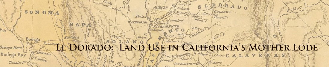
Not all land in the Mother Lode is suited to crop production. It suffers in this regard from its location in the sometimes rocky terrain of the Sierra foothills and in the Sierra Nevada Mountains themselves. How much of the available land in the region has been farmed? Exploring farm census data from several decades of the 20th century will allow you to create a picture of just how intensively the available land has been used, for what crops, and how crop preferences have changed.
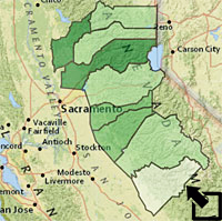
Open the El Dorado: Agriculture map and zoom in on the Mother Lode.
The number of acres given to agriculture in the Mother Lode counties in 1929 is one of the variables in the Mother Lode Agriculture layer. Open the pop-up for each county and determine the percentage of acres in each county devoted to agriculture that year.
To Start You Thinking -
1) In what county was the percentage of cropland the greatest in 1929? Least? Modify the transparency of the Mother Lode Agriculture layer, switch to an Imagery basemap, and explore what geographic factor contribute to these facts?
Discuss your conclusions.
2) The pop-up for each county shows a column chart comparing the number of acres of cropland in each of the Mother Lode counties over the decades with that in 1929. In Yuba County, for example, you will see that in 1949 the amount of land farmed was 139% of what it was in 1929. Study the graphs for all nine counties. Describe any general pattern you see and identify historical events that may account for the changes.
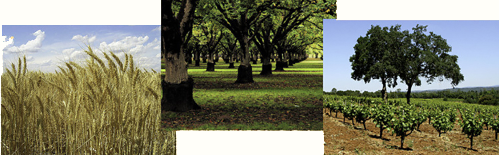
Notice that there is data for each of the five most commonly grown Mother Lode crops (hay, wheat, apples, grapes, and walnuts) from 1929 through 1997. These layers each have a time slider you can use to explore the production of each of these crops over time.
3) What was the leading crop in El Dorado County in 1929? In the Mother Lode region as a whole? Is this crop still the leading crop in 1997?
4) How did the production of each of the five major Mother Lode crops (hay, wheat, apples, grapes, and walnuts) vary county-by county over the 20th century? Prepare maps and/or graphs that will allow you to address this question. Write a short written summary of your results referring to the data and your maps or graphs as appropriate.